What do colors say about music? For this project, I wanted to explore how the colors from each of Taylor Swift’s album covers reflect the emotional themes in her lyrics. Using a color palette generator (coolors.co), I analyzed the dominant colors in 11 of her album covers; from her 2006 debut all the way to The Tortured Poets Department in 2024. I paired each palette with a few of that era’s standout songs to see if there was a deeper visual-language connection. Across her discography, Taylor’s visuals consistently reinforce her sound and emotional development. Her debut and Fearless albums, for example, are filled with soft beiges, golds, warm, and gentle colors that match their youthful country themes of innocence and first love. Speak Now shifts into lavender and plum tones, echoing its blend of fairytale energy and growing vulnerability. Then comes Red, where we see bolder, chaotic tones like crimson and dark purple which are perfect for an album centered on heartbreak and emotional extremes. 1989 turns cooler and sleeker with pastels and blue-greys, reflecting its new pop sound and focus on reinvention.
Albums like Reputation and Midnights go dark (literally) with blacks, silvers, and midnight blues, matching themes of secrecy, identity, and introspection. In contrast, Lover is a pastel explosion, just as whimsical and romantic as the album sounds. The subdued greys and warm earth tones of Folklore and Evermore reflect quiet reflection and emotional storytelling.
Finally, The Tortured Poets Department leans into washed-out neutrals and vintage greys which are tones that feel literary, damaged, and deeply emotional, much like the album’s lyrical content. In short: Taylor Swift’s color choices aren’t just aesthetic they’re thematic. Her album visuals act as mood boards, giving us a preview of the emotional journey we’re about to hear.
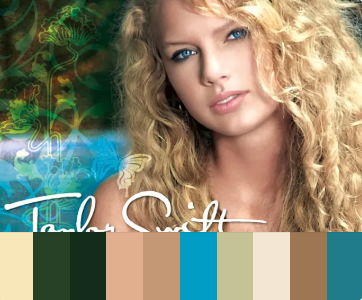
Key Songs: Our Song, Teardrops on My Guitar, Tim McGraw
Color Palette: Soft golds, sage greens, tan browns = youthful, natural, country vibe
Theme Connection: The warm, earthy tones reflect the innocence and nostalgia of teenage romance and small-town life. The palette’s simplicity mirrors the stripped-down, acoustic sound of her country roots.
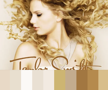
Key Songs:You Belong with Me, Love Story
Color Palette: Creams, soft golds, pastel beiges = romantic, dreamy
Theme Connection: These fairytale-inspired songs match the ethereal, light palette. The visuals evoke a world of fantasy and idealism just like the lyrical themes of true love and teenage yearning.
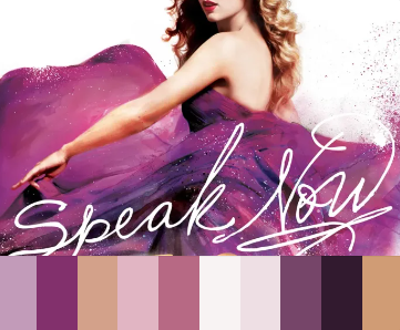
Key Songs:Mean, Mine, Sparks Fly, Back to December
Color Palette: Lavenders, dusty pinks, dark violets = emotional, reflective
Theme Connection: The mood shifts more personal and confessional. The rich, sometimes moody tones represent a blend of whimsy and emotional depth, matching the lyrical growth and vulnerability.
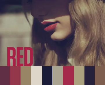
Key Songs:All Too Well, I Knew You Were Trouble, Red
Color Palette: Deep reds, muted purples, charcoal = passionate, chaotic
Theme Connection: As Taylor sings about heartbreak, memory, and intensity, the palette reflects emotional extremes. “Red” as a title sets the tone: bold, vivid, unstable emotions, just like the breakup themes in All Too Well.
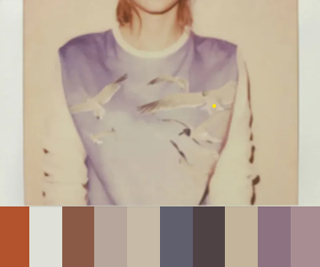
Key Songs:Blank Space, Style, Bad Blood
Color Palette: Neutrals, dusty rose, soft grays = retro, sleek, slightly cold
Theme Connection: The soft and minimalist tones of 1989 reflect the clean, cool aesthetic of Taylor’s shift into synth-pop. The visuals feel curated and slightly detached, much like the album’s focus on identity, reinvention, and how we present ourselves to the world. It’s retro, sleek, and icy in a way that matches both the polished production and the emotional distance in the lyrics.
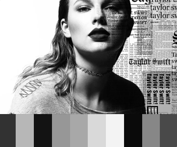
Key Songs:Delicate, Look What You Made Me Do, Getaway Car
Color Palette: Black, gray, silver tones = edgy, secretive, metallic
Theme Connection: The grayscale palette matches themes of vengeance, reinvention, and media perception. It’s a dramatic aesthetic for a dramatic era—cold, defensive, and defiant.
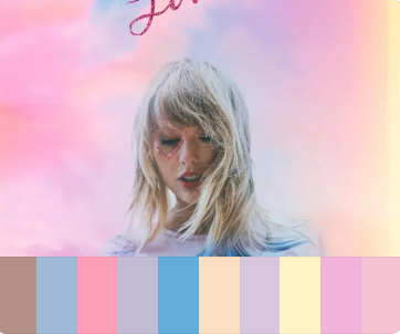
Key Songs:Cruel Summer, Lover, Paper Rings
Color Palette: Pinks, pastels, sky blue = bright, whimsical, romantic
Theme Connection: The palette is pure warmth, joy, light, and rainbow-esque. It's visually playful and heartfelt, complementing the album's themes of new love, celebration, and emotional autonomy.
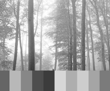
Key Songs:Exile, Cardigan, Illicit Affairs
Color Palette: Grayscale and foggy tones = muted, introspective, melancholic
Theme Connection: This album is all about internal landscapes. The muted gray tones reflect isolation, longing, and nostalgia, mirroring the subdued, indie-folk storytelling.
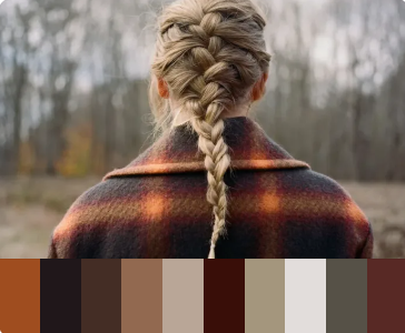
Key Songs:Champagne Problems, Tolerate It, Willow
Color Palette: Deep browns, moss greens, warm taupes = rustic, mature, introspective
Theme Connection: Compared to Folklore, this album leans more autumnal and grounded. The earthy tones reflect mature melancholy—emotional complexity rooted in regret and reflection.
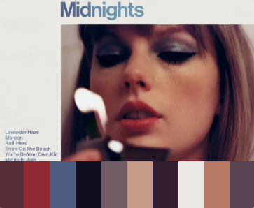
Key Songs:Anti-Hero, Karma, Lavender Haze, Maroon
Color Palette: Deep blues, purples, soft neutrals = dreamy, moody, introspective
Theme Connection: This palette captures the “late-night thoughts” aesthetic—dark, moody, a bit mysterious. The songs explore insecurity, ego, and self-exploration, all under the cover of night.
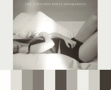
Key Songs:Fortnight, Who's Afraid of Little Old Me?, Down Bad
Color Palette: Cream, gray, parchment, faded black = vintage, poetic, worn-down
Theme Connection: The colors evoke old books and typewriters—perfect for an album about disillusionment, artistry, and emotional scars. It feels like a journal entry come to life.
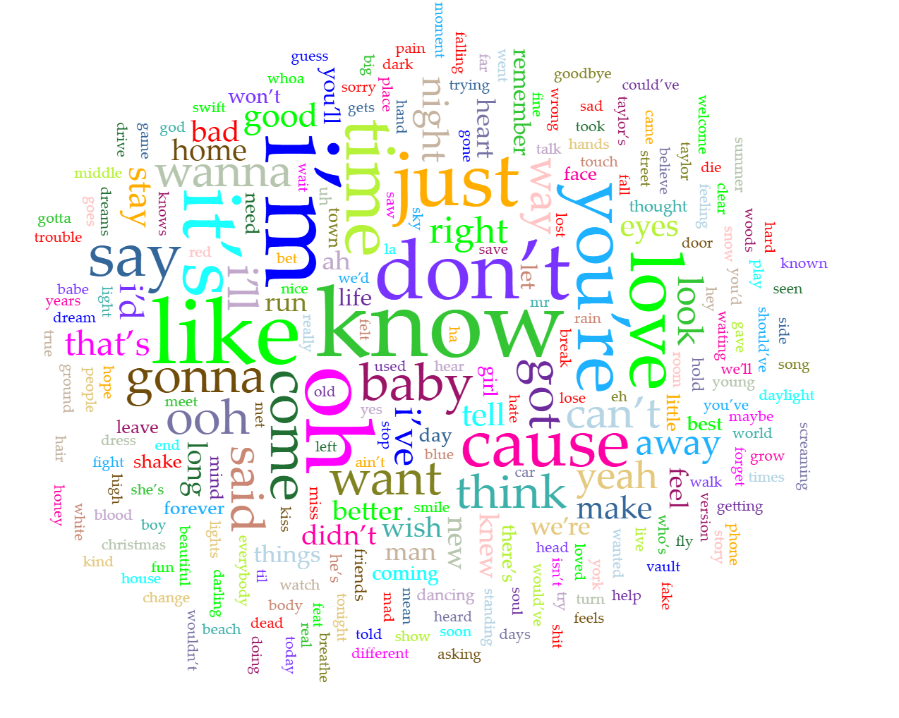
To get a broader sense of the language Taylor Swift uses across her music, I used Voyant Tools to analyze the full text of her lyrics. I found a publicly available lyrics collection on Scribd.com and downloaded it as a TXT file. It was only 693KB in size but packed with a lot of content. According to Voyant, the corpus includes 91,767 words with 5,180 unique word forms. Some of the most frequent words were “I’m” (753), “like” (716), “oh” (631), “know” (614), and “it’s” (584). I especially enjoyed using the Cirrus visualization, which creates a word cloud where the most-used words appear largest. It’s a fun and fast way to see what themes or emotions might repeat across her songs like personal reflection, relationships, and expression. Below is the image I created with this tool.
To explore the emotional impact of color across Taylor Swift’s eras, I used a tool called Kumu, which lets you visually map relationships between concepts. I created a map connecting Taylor to her albums, and each album to its dominant colors. Then I added emotional associations for nine core colors, based on research from the Verywell Mind article: Color Psychology: Does It Affect How You Feel?. What stood out most was how often purple, blue, and black appeared—each tied to strong emotional cues. Purple is often linked to mystery, nobility, and glamor, which fits well with albums like Speak Now and Midnights, where Taylor blends vulnerability with a polished aesthetic. Blue, associated with peace, hope, and reflection, runs through eras like 1989 and Lover, where the mood shifts toward healing and introspection. Black, tied to mystery and coldness, echoes the edgier tone of Reputation, where image, isolation, and power play major roles. Using Kumu helped me see how Taylor’s visuals, music, and messaging all layer together, and how color really becomes part of her storytelling. Below is the map I built using this tool.
This project helped me see how Taylor Swift uses visuals (especially color) as part of the storytelling in her music. By combining digital tools with cultural analysis, I was able to explore the emotional patterns that run through her albums in a deeper way. Using Voyant Tools, I uploaded a large text file of all her lyrics and created a Cirrus word cloud to visualize the most frequently used words. This showed how often Taylor returns to personal, emotional language (words like “I’m,” “like,” and “know”) which suggests how central self-reflection and storytelling are to her music. Then, by building color palettes for each album and analyzing their emotional associations through research I connected those palettes with key themes in each era. Finally, I used Kumu to map the relationships between Taylor, her albums, and nine core colors linked to emotional meanings. Across the map, colors like purple (mysterious, glamorous), blue (peaceful, thoughtful), and black (cold, bold) stood out, repeating across multiple albums and matching the moods of the songs. These digital tools helped me visualize and understand patterns that aren’t always obvious at first glance. They showed how Taylor’s visuals and lyrics work together to build consistent emotional worlds across her career.
Kendra Cherry, K. (2024) "Color Psychology: Does It Affect How You Feel?", Verywell Mind. Available at: https://www.verywellmind.com/color-psychology-2795824 (Accessed: 13 June 2025).
Pascual, Danielle. “Every Taylor Swift Album Cover, Ranked.” Billboard, Billboard, 17 Apr. 2024, www.billboard.com/photos/taylor-swift-album-covers-1235157895/1-taylor-swift-self-titled-billboard-1240/.
Rankin, Seija, et al. “The Best Taylor Swift Song from Each Album.” EW.Com, Entertainment Weekly, 3 May 2024, ew.com/best-taylor-swift-songs-8634049.
“Taylor Swift Albums Discography.” Wikipedia, Wikimedia Foundation , 30 May 2025, en.wikipedia.org/wiki/Taylor_Swift_albums_discography.
“Taylor Swift. All Taylor Swift Songs Lyrics 2024.” 2024. Scribd, https://www.scribd.com/document/730122348/All-Taylor-Swift-Songs-Lyrics-2024#download. Accessed 13 June 2025.